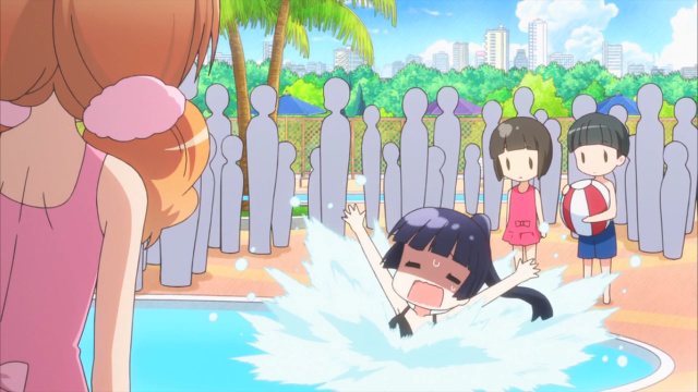
Wakaba-san at a water park.
It’s been a while since I’ve written a proper post so I’ll talk about what little I have been watching over the past few months and what I might make posts about in the near future.
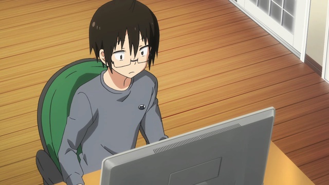
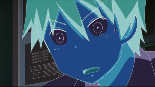
I haven’t been keeping up with most of the summer anime series I started watching in July, mainly the ones with full-length episodes. (Here’s a general impressions post from that month with my feelings about 13 summer anime after seeing a couple episodes from each show.)
I’ll finish what I can over the coming weeks and maybe make a short wrap-up post for each one I complete. The same goes for many winter and spring 2015 series that I began without reaching their final episodes, although posts about those may come sometime after I get done with summer shows.
I was happy that Wakako-zake was eventually added to Crunchyroll’s simulcast lineup in mid-August.
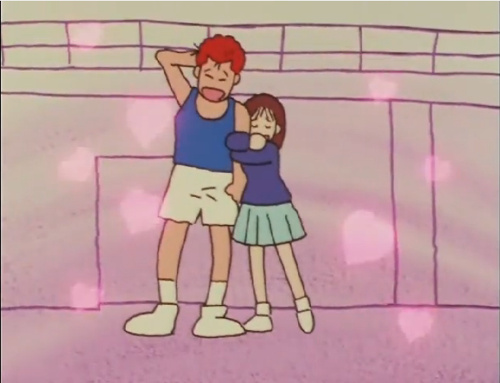
The anime I’ve watched the most recently is the Dirty Pair TV series (1985) with the weekly SCCSAV Classics group – we’re about halfway through it after this past weekend’s batch of episodes. It’s been mainly episodic so far and some of the Lovely Angels’ adventures have been more entertaining than others.
Part of the time I didn’t spend watching anime was occupied by listening to music from various anime through the Music in Anime tumblr. I also participated in an episode of the Taiiku Podcast about Cinedigm’s first two-disc DVD set of ’90s basketball anime Slam Dunk. I haven’t listened to that particular episode yet, partly I don’t like hearing my own recorded voice.
We began by discussing some issues we had with the physical release and then moved onto talking about the content of the 14 episodes in that set. I liked what I saw in those episodes enough that I’d like to watch more of the series. If you’re curious about experiencing the English dub for yourself, the same episodes that were on that Cinedigm set are currently on Hulu. Meanwhile, the whole 101-episode series is still available on Crunchyroll with Japanese audio and English hardsubs.
Briefly looking ahead at the new crop of anime set to debut in October, I’m interested in checking out the following shows:
I haven’t made any progress on the Catching Up On Detective Conan project since my season 2 post at the end of May. The next things I need to watch for that are the 1st theatrical film (The Time-Bombed Skyscraper) and then season 3 as arranged by Funimation in North America, which begins with a double episode (The Mist Goblin Murder) and wraps up with a double episode featuring the debut of Kaitou Kid.